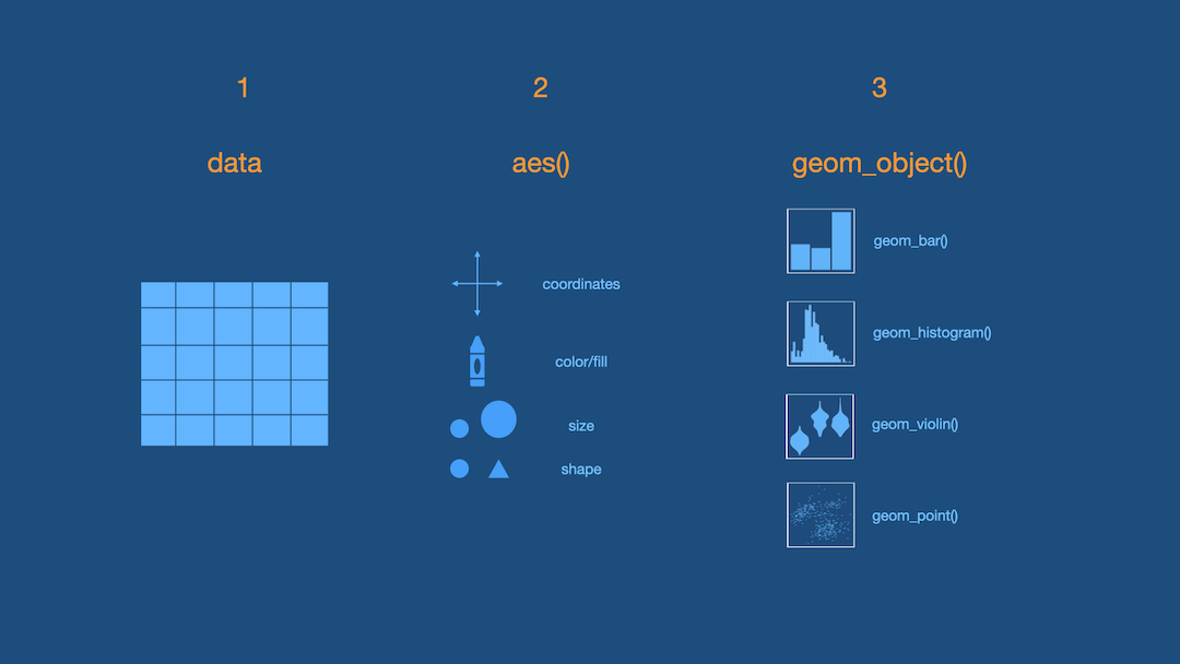
ggplot is based on grammar of graphics.
If you could speak to R in English, how would you tell R to make this plot for you?
OR
If you had the data and had to draw this bar plot by hand, what would you do?

Possible ideas
- Consider the data frame
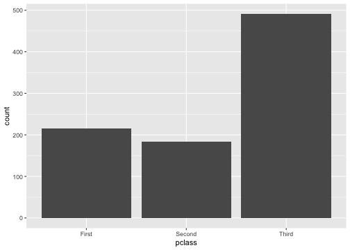
- Count number of passengers in each
pclass - Put
pclasson x-axis. - Put
counton y-axis. - Draw the bars.

These ideas are all correct but some are not necessary in R
- Consider the data frame
Count number of passengers in eachpclass- Put
pclasson x-axis. Put.counton y-axis- Draw the bars.
R will do some of these steps by default. Making a bar plot with another tool might look slightly different.
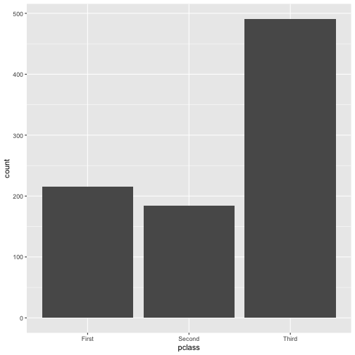
Step 1 - Pick Data
ggplot(data = titanic)
Step 2 - Map Data to Aesthetics
ggplot(data = titanic, aes(x = pclass))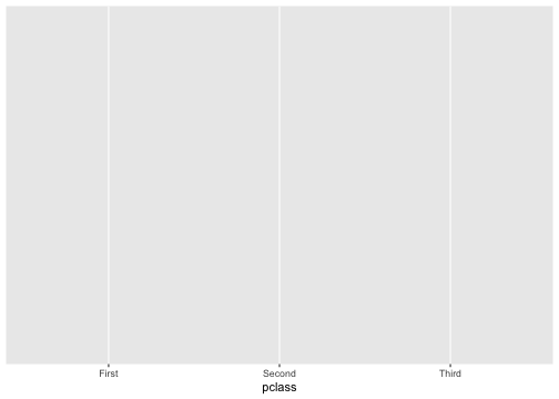
Step 3 - Add the Geometric Layer
ggplot(data = titanic, aes(x = pclass)) + geom_bar()

Step 1 - Pick Data
ggplot(data = titanic)
Step 2 - Map Data to Aesthetics
ggplot(data = titanic, aes(x = fare))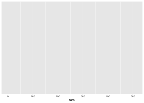
Step 3 - Add the Geometric Layer
ggplot(data = titanic, aes(x = fare)) + geom_histogram()## `stat_bin()` using `bins = 30`. Pick better value with `binwidth`.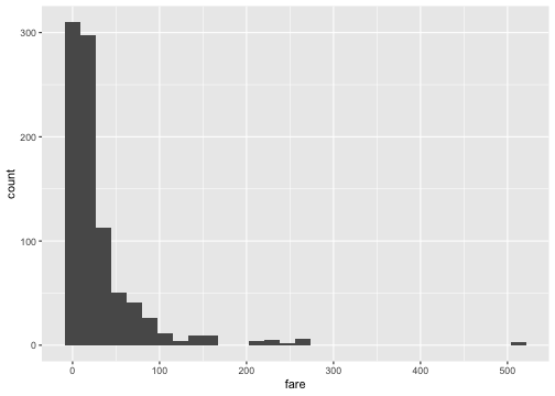
What is this warning?
## `stat_bin()` using `bins = 30`. Pick better value with `binwidth`.
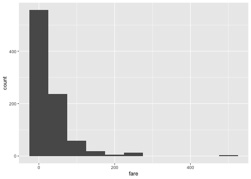
ggplot(data = titanic, aes(x = fare)) + geom_histogram(binwidth = 15)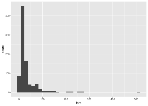

ggplot(data = titanic, aes(x = fare)) + geom_histogram(binwidth = 15, color = "white")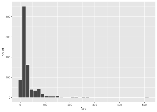
ggplot(data = titanic, aes(x = fare)) + geom_histogram(binwidth = 15, fill = "darkred")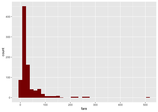
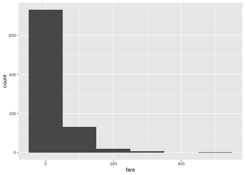
ggplot(data = titanic, aes(x = fare)) + geom_histogram(binwidth = 15, color = "white", fill = "darkred")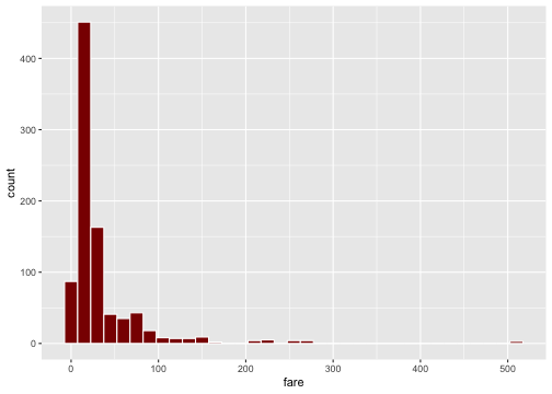
Stacked Bar-Plot
ggplot(data = titanic, aes(x = pclass, fill = survived)) + geom_bar()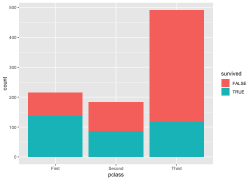
Standardized Bar Plot
ggplot(data = titanic, aes(x = pclass, fill = survived)) + geom_bar(position = "fill")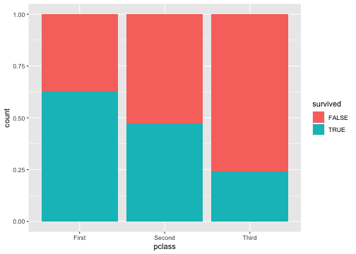
Note that y-axis is no longer count but we will learn how to change that later.
Dodged Bar Plot
ggplot(data = titanic, aes(x = pclass, fill = survived)) + geom_bar(position = "dodge")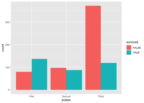
Note that y-axis is no longer count but we will change that later.

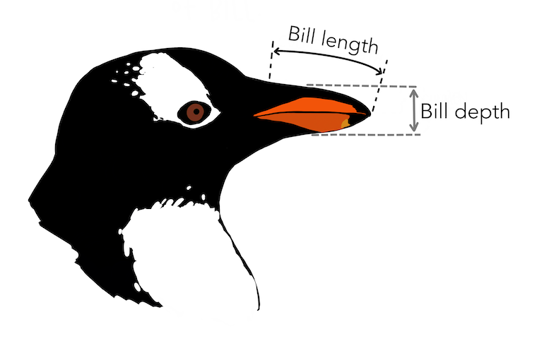
Artwork by @allison_horst
ggplot(penguins, aes(x = bill_depth_mm, y = bill_length_mm)) + geom_point()## Warning: Removed 2 rows containing missing values (geom_point).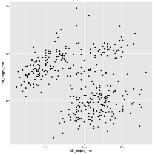
ggplot(penguins, aes(x = bill_depth_mm, y = bill_length_mm, color = species)) + geom_point()## Warning: Removed 2 rows containing missing values (geom_point).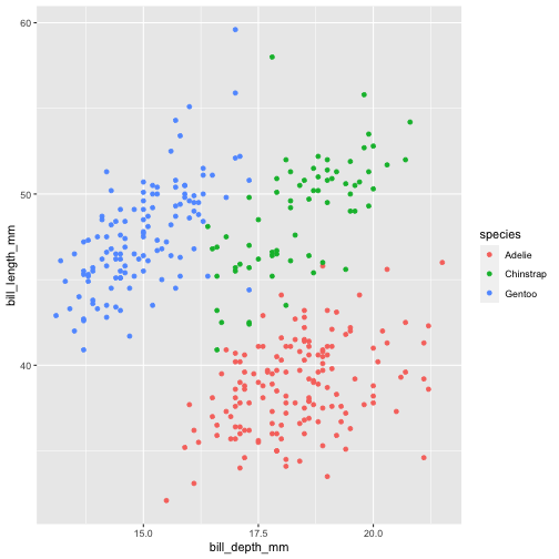
ggplot(penguins, aes(x = bill_depth_mm, y = bill_length_mm, shape = species)) + geom_point()## Warning: Removed 2 rows containing missing values (geom_point).
ggplot(penguins, aes(x = bill_depth_mm, y = bill_length_mm, shape = species)) + geom_point()## Warning: Removed 2 rows containing missing values (geom_point).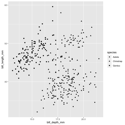
ggplot(penguins, aes(x = bill_depth_mm, y = bill_length_mm, shape = species, color = species)) + geom_point()## Warning: Removed 2 rows containing missing values (geom_point).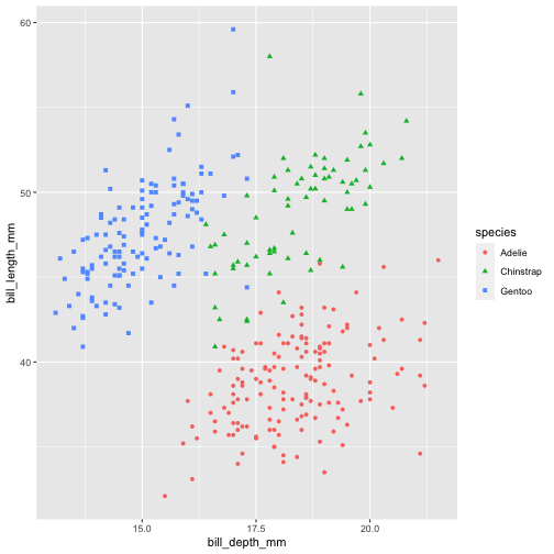
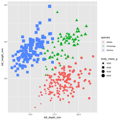
ggplot(penguins, aes(x = bill_depth_mm, y = bill_length_mm, shape = species, color = species, size = body_mass_g)) + geom_point()## Warning: Removed 2 rows containing missing values (geom_point).