class: title-slide <br> <br> .right-panel[ # Introduction to ggplot ## Dr. Mine Dogucu ] --- class: middle - This specific lecture will not necessarily show you beautiful plots. -- - In this lecture we will focus on how ggplot works. -- - In the next lecture we will improve the plots that we make. --- center: invisible __gg__plot is based on __g__rammar of __g__raphics. <img src="img/grammar_graphics.jpeg" width="237" /> --- ## Data ```r glimpse(titanic) ``` ``` ## Rows: 891 ## Columns: 6 ## $ survived <lgl> FALSE, TRUE, TRUE, TRUE, FALSE, FALSE, FALSE, FALSE, TRUE, TR… ## $ pclass <chr> "Third", "First", "Third", "First", "Third", "Third", "First"… ## $ sex <fct> sex, sex, sex, sex, sex, sex, sex, sex, sex, sex, sex, sex, s… ## $ age <dbl> 22, 38, 26, 35, 35, NA, 54, 2, 27, 14, 4, 58, 20, 39, 14, 55,… ## $ fare <dbl> 7.2500, 71.2833, 7.9250, 53.1000, 8.0500, 8.4583, 51.8625, 21… ## $ embarked <fct> Southampton, Cherbourg, Southampton, Southampton, Southampton… ``` .footnote[The data frame has been cleaned for you.] --- class:inverse middle .font75[Visualizing a Single Categorical Variable] --- class: middle .left-panel[ <br> <br> If you could speak to R in English, how would you tell R to make this plot for you? OR If you had the data and had to draw this bar plot by hand, what would you do? ] .right-panel[ <!-- --> ] --- class: middle .left-panel[ <br> <br> Possible ideas - Consider the data frame - Count number of passengers in each `pclass` - Put `pclass` on x-axis. - Put `count` on y-axis. - Draw the bars. ] .right-panel[ <!-- --> ] --- class: middle .left-panel[ <br> <br> These ideas are all correct but some are not necessary in R - Consider the data frame - ~~Count number of passengers in each `pclass`~~ - Put `pclass` on x-axis. - ~~Put `count` on y-axis~~. - Draw the bars. R will do some of these steps by default. Making a bar plot with another tool might look slightly different. ] .right-panel[ 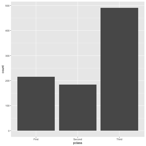<!-- --> ] --- class: middle **3 Steps of Making a Basic ggplot** 1.Pick data 2.Map data onto aesthetics 3.Add the geometric layer --- class: middle ### Step 1 - Pick Data .pull-left[ ```r ggplot(data = titanic) ``` ] .pull-right[ <!-- --> ] --- class: middle ### Step 2 - Map Data to Aesthetics .pull-left[ ```r ggplot(data = titanic, * aes(x = pclass)) ``` ] .pull-right[ 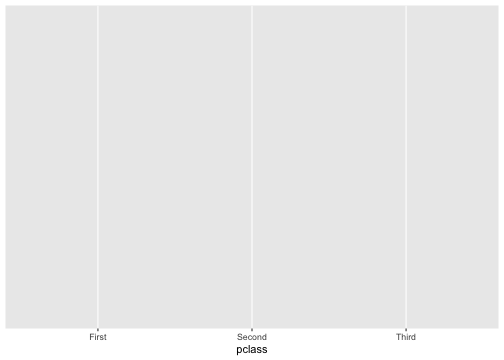<!-- --> ] --- class: middle ### Step 3 - Add the Geometric Layer .pull-left[ ```r ggplot(data = titanic, aes(x = pclass)) + * geom_bar() ``` ] .pull-right[ 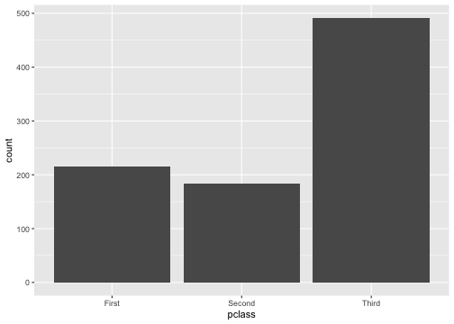<!-- --> ] --- class: middle .panelset[ .panel[ .panel-name[Plot] <img src="02b-intro-ggplot_files/figure-html/unnamed-chunk-13-1.png" style="display: block; margin: auto;" /> ] .panel[ .panel-name[English] - Create a ggplot using the `titanic` data frame. - Map the `pclass` to the x-axis. - Add a layer of a bar plot. ] .panel[ .panel-name[R] ```r ggplot(data = titanic, aes(x = pclass)) + geom_bar() ``` ] ] --- class:inverse middle .font75[Visualizing a Single Numeric Variable] --- class: middle .panelset[ .panel[ .panel-name[Plot] ``` ## `stat_bin()` using `bins = 30`. Pick better value with `binwidth`. ``` <img src="02b-intro-ggplot_files/figure-html/unnamed-chunk-15-1.png" style="display: block; margin: auto;" /> ] .panel[ .panel-name[English] - Create a ggplot using the `titanic` data frame. - Map the `fare` to the x-axis. - Add a layer of a histogram. ] .panel[ .panel-name[R] ```r ggplot(data = titanic, aes(x = fare)) + geom_histogram() ``` ] ] --- class: middle ### Step 1 - Pick Data .pull-left[ ```r ggplot(data = titanic) ``` ] .pull-right[ <!-- --> ] --- class: middle ### Step 2 - Map Data to Aesthetics .pull-left[ ```r ggplot(data = titanic, * aes(x = fare)) ``` ] .pull-right[ 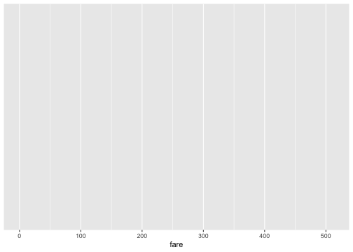<!-- --> ] --- class: middle ### Step 3 - Add the Geometric Layer .pull-left[ ```r ggplot(data = titanic, aes(x = fare)) + * geom_histogram() ``` ] .pull-right[ ``` ## `stat_bin()` using `bins = 30`. Pick better value with `binwidth`. ``` 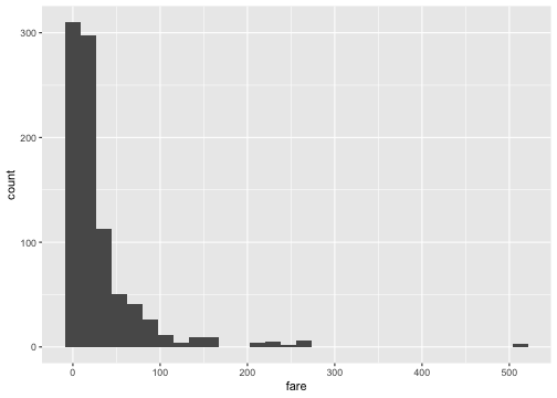<!-- --> ] --- ## What is this warning? ``` ## `stat_bin()` using `bins = 30`. Pick better value with `binwidth`. ``` <img src="02b-intro-ggplot_files/figure-html/unnamed-chunk-23-1.png" style="display: block; margin: auto;" /> --- ```r ggplot(data = titanic, aes(x = fare)) + * geom_histogram(binwidth = 15) ``` <img src="02b-intro-ggplot_files/figure-html/unnamed-chunk-24-1.png" style="display: block; margin: auto;" /> --- class: middle .panelset[ .panel[.panel-name[binwidth = 15] .left-panel[ ] <img src="02b-intro-ggplot_files/figure-html/unnamed-chunk-25-1.png" style="display: block; margin: auto;" /> ] .panel[.panel-name[binwidth = 50] <img src="02b-intro-ggplot_files/figure-html/unnamed-chunk-26-1.png" style="display: block; margin: auto;" /> ] .panel[.panel-name[binwidth = 100] <img src="02b-intro-ggplot_files/figure-html/unnamed-chunk-27-1.png" style="display: block; margin: auto;" /> ] ] --- class: middle center [There is no "best" number of bins](https://en.wikipedia.org/wiki/Histogram#Number_of_bins_and_width) --- class: middle center .font150[ 🌈 ] Pick your favorite color(s) from the list at: [bit.ly/colors-r](https://bit.ly/colors-r) --- ```r ggplot(data = titanic, aes(x = fare)) + geom_histogram(binwidth = 15, * color = "white") ``` <img src="02b-intro-ggplot_files/figure-html/unnamed-chunk-28-1.png" style="display: block; margin: auto;" /> --- ```r ggplot(data = titanic, aes(x = fare)) + geom_histogram(binwidth = 15, * fill = "darkred") ``` <img src="02b-intro-ggplot_files/figure-html/unnamed-chunk-29-1.png" style="display: block; margin: auto;" /> --- ```r ggplot(data = titanic, aes(x = fare)) + geom_histogram(binwidth = 15, * color = "white", * fill = "darkred") ``` <img src="02b-intro-ggplot_files/figure-html/unnamed-chunk-30-1.png" style="display: block; margin: auto;" /> --- class: inverse middle center .font75[Visualizing Two Categorical Variables] --- ## Stacked Bar-Plot .pull-left[ ```r ggplot(data = titanic, aes(x = pclass, * fill = survived)) + geom_bar() ``` ] .pull-right[ 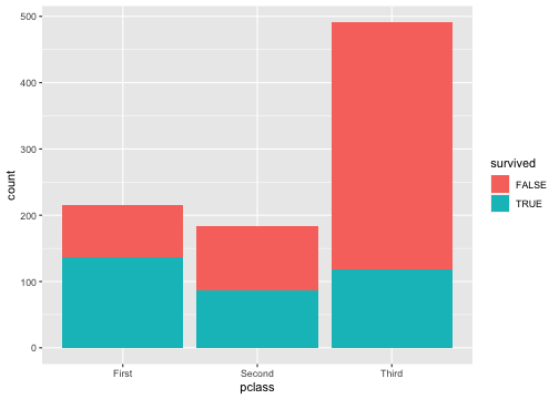<!-- --> ] --- ## Standardized Bar Plot .pull-left[ ```r ggplot(data = titanic, aes(x = pclass, fill = survived)) + * geom_bar(position = "fill") ``` ] .pull-right[ 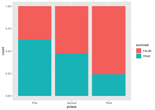<!-- --> ] .footnote[Note that y-axis is no longer count but we will learn how to change that later.] --- ## Dodged Bar Plot .pull-left[ ```r ggplot(data = titanic, aes(x = pclass, fill = survived)) + * geom_bar(position = "dodge") ``` ] .pull-right[ 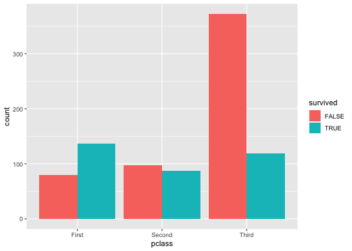<!-- --> ] .footnote[Note that y-axis is no longer count but we will change that later.] --- ## New Data <img src="img/penguins.png" width="667" style="display: block; margin: auto;" /> .footnote[Artwork by [@allison_horst](https://twitter.com/allison_horst) ] --- ## New Data ```r glimpse(penguins) ``` ``` ## Rows: 344 ## Columns: 8 ## $ species <fct> Adelie, Adelie, Adelie, Adelie, Adelie, Adelie, Adel… ## $ island <fct> Torgersen, Torgersen, Torgersen, Torgersen, Torgerse… ## $ bill_length_mm <dbl> 39.1, 39.5, 40.3, NA, 36.7, 39.3, 38.9, 39.2, 34.1, … ## $ bill_depth_mm <dbl> 18.7, 17.4, 18.0, NA, 19.3, 20.6, 17.8, 19.6, 18.1, … ## $ flipper_length_mm <int> 181, 186, 195, NA, 193, 190, 181, 195, 193, 190, 186… ## $ body_mass_g <int> 3750, 3800, 3250, NA, 3450, 3650, 3625, 4675, 3475, … ## $ sex <fct> male, female, female, NA, female, male, female, male… ## $ year <int> 2007, 2007, 2007, 2007, 2007, 2007, 2007, 2007, 2007… ``` --- <img src="img/penguin_bill.png" width="1036" style="display: block; margin: auto;" /> .footnote[Artwork by [@allison_horst](https://twitter.com/allison_horst) ] --- class: middle inverse .font75[Visualizing a single numerical and single categorical variable.] --- class: middle .panelset[ .panel[ .panel-name[Plot] ``` ## Warning: Removed 2 rows containing non-finite values (stat_ydensity). ``` <img src="02b-intro-ggplot_files/figure-html/unnamed-chunk-40-1.png" style="display: block; margin: auto;" /> ] .panel[ .panel-name[English] - Create a ggplot using the `penguins` data frame. - Map the `species` to the x-axis and `bill_length_mm` to the y-axis. - Add a layer of a violin plot. ] .panel[ .panel-name[R] ```r ggplot(penguins, aes(x = species, y = bill_length_mm)) + geom_violin() ``` ] ] --- .pull-left[ 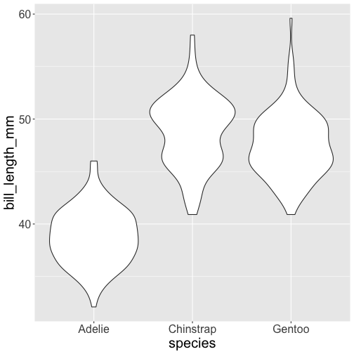<!-- --> ] .pull-right[ 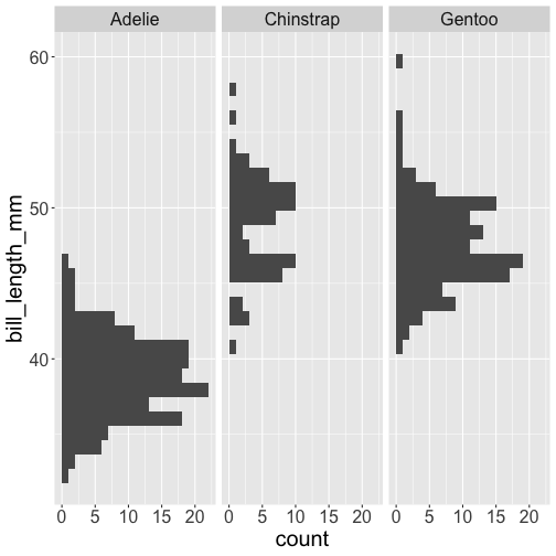<!-- --> ] --- class: inverse middle .font75[Visualizing Two Numerical Variables] --- .left-panel[ ```r ggplot(penguins, aes(x = bill_depth_mm, y = bill_length_mm)) + geom_point() ``` ] .right-panel[ ``` ## Warning: Removed 2 rows containing missing values (geom_point). ``` 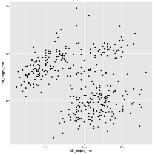<!-- --> ] --- class: middle inverse .font75[Considering More Than Two Variables] --- .left-panel[ ```r ggplot(penguins, aes(x = bill_depth_mm, y = bill_length_mm, color = species)) + geom_point() ``` ] .right-panel[ ``` ## Warning: Removed 2 rows containing missing values (geom_point). ``` 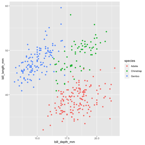<!-- --> ] --- .left-panel[ ```r ggplot(penguins, aes(x = bill_depth_mm, y = bill_length_mm, shape = species)) + geom_point() ``` ] .right-panel[ ``` ## Warning: Removed 2 rows containing missing values (geom_point). ``` <!-- --> ] --- .left-panel[ ```r ggplot(penguins, aes(x = bill_depth_mm, y = bill_length_mm, shape = species)) + geom_point() ``` ] .right-panel[ ``` ## Warning: Removed 2 rows containing missing values (geom_point). ``` 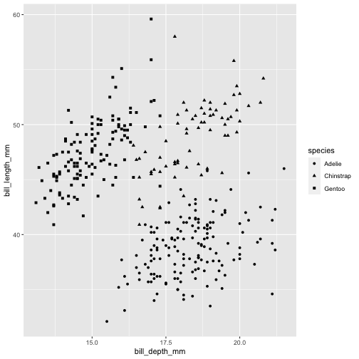<!-- --> ] --- .left-panel[ ```r ggplot(penguins, aes(x = bill_depth_mm, y = bill_length_mm, shape = species, color = species)) + geom_point() ``` ] .right-panel[ ``` ## Warning: Removed 2 rows containing missing values (geom_point). ``` 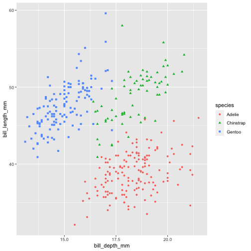<!-- --> ] --- .left-panel[ ```r ggplot(penguins, aes(x = bill_depth_mm, y = bill_length_mm, shape = species, color = species, size = body_mass_g)) + geom_point() ``` ] .right-panel[ ``` ## Warning: Removed 2 rows containing missing values (geom_point). ``` 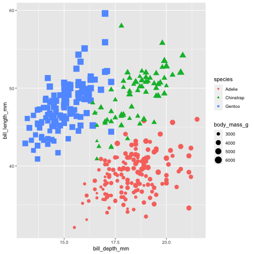<!-- --> ] --- <img src="img/ggplot-summary.jpeg" width="95%" />